lemon chilli media

Categories
Uncategorized

Sikandar

Meet Our Client

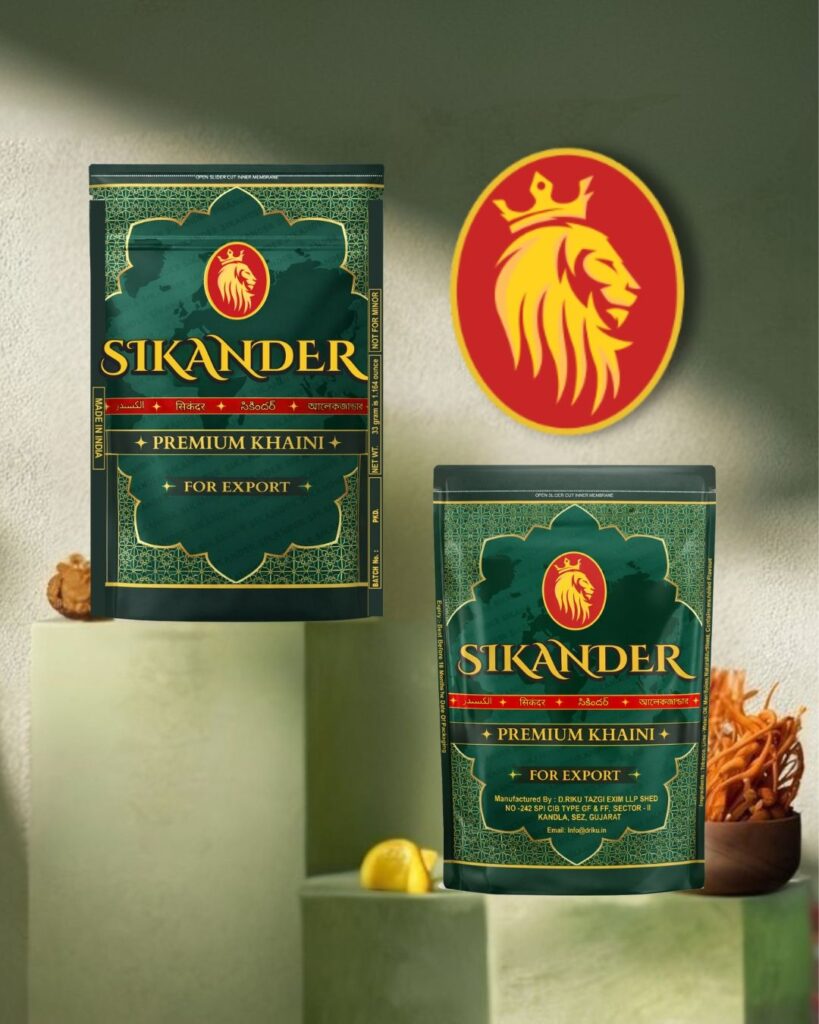
Sikandar is a bold and dynamic Dubai-based brand in the tobacco industry, positioned to reflect strength, heritage, and confidence. With a focus on premium quality and strong market recall, Sikandar aims to establish a distinct identity within a highly competitive segment through impactful design and branding.

Objective :

To create a powerful and recognizable brand identity that captures the essence of “Sikandar” — symbolizing dominance, trust, and legacy. The goal was to design packaging and branding that not only stands out on shelves but also conveys a sense of authority and sophistication, appealing to its target audience.

What We Did :

  • Logo Design: Crafted a distinctive and timeless logo that embodies the brand’s strong persona. The design combines bold typography and regal elements to reflect the commanding nature of the name “Sikandar.”
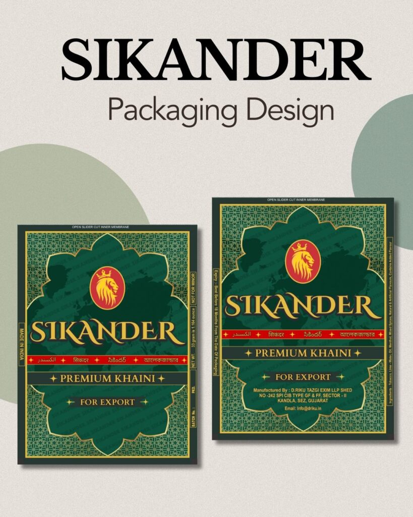
  • Packaging Design: Developed eye-catching packaging that balances premium aesthetics with practicality. Each design was carefully crafted to ensure high shelf visibility, strong brand recall, and a consistent look across product variants.
  • Results :

  • Delivered a premium and cohesive brand identity that elevated the brand’s market presence.
  • Created packaging that enhances consumer recall and visibility at retail points.
  • Strengthened Sikandar’s positioning as a confident, high-impact brand in the tobacco industry.
  • Categories
    Uncategorized

    Asian-Toys

    Meet Our Client

    Asian Toys is one of India’s largest toy manufacturers, known for offering a wide range of playful and educational toys for children. With a strong focus on creativity and child development, the brand continues to innovate in both product design and presentation. Their toys are sold across Tier 1, Tier 2, Tier 3 cities and major metropolitan markets, making Asian Toys a trusted name in households across the India.

    Objective :

    To design visually appealing and functional packaging for Asian Toys that reflects the joy and imagination of play while aligning with brand values of quality and child engagement. The goal was to create packaging that not only attracts attention on store shelves but also clearly communicates product features and usage, enhancing buyer trust and appeal.

    What We Did :

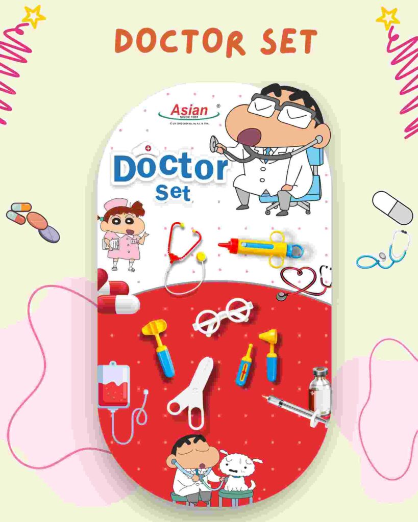
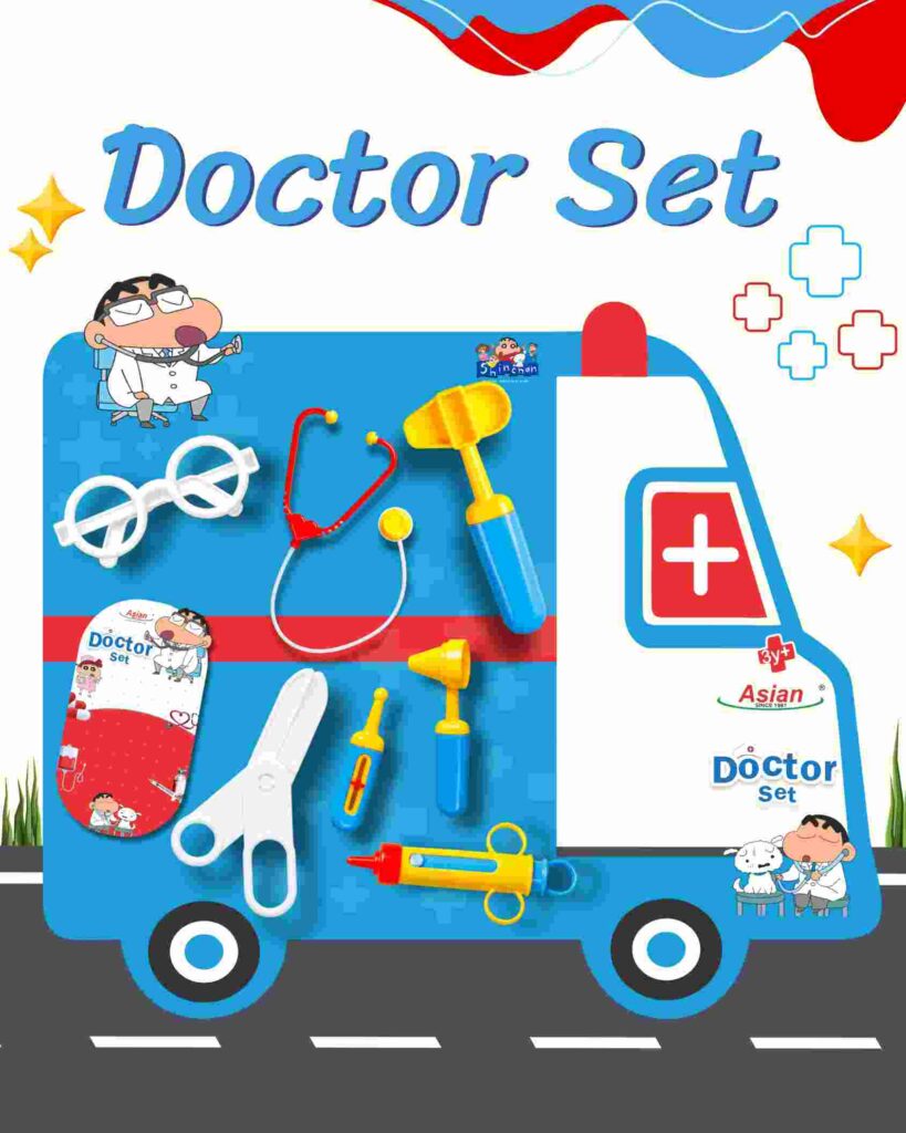
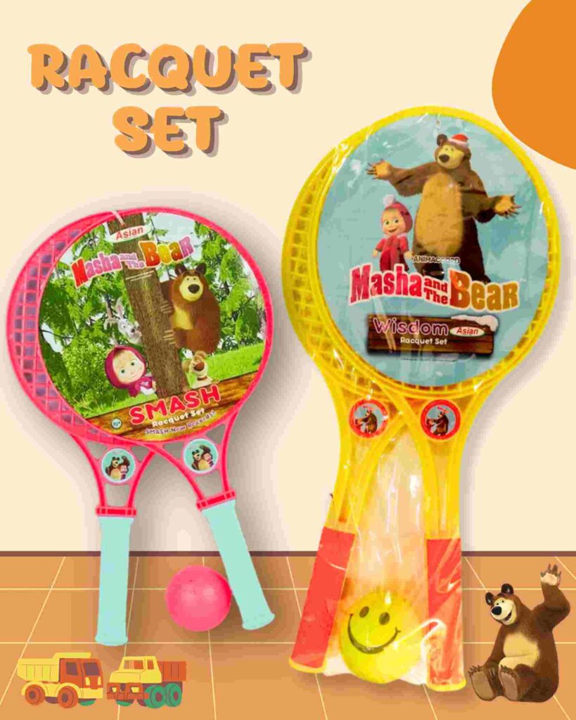
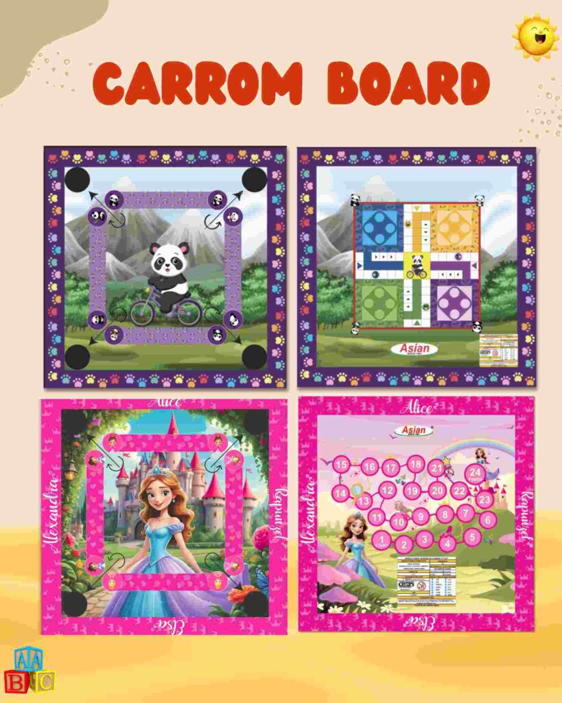
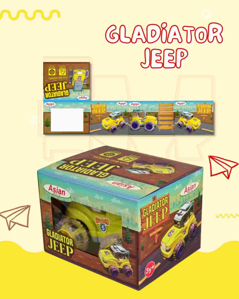
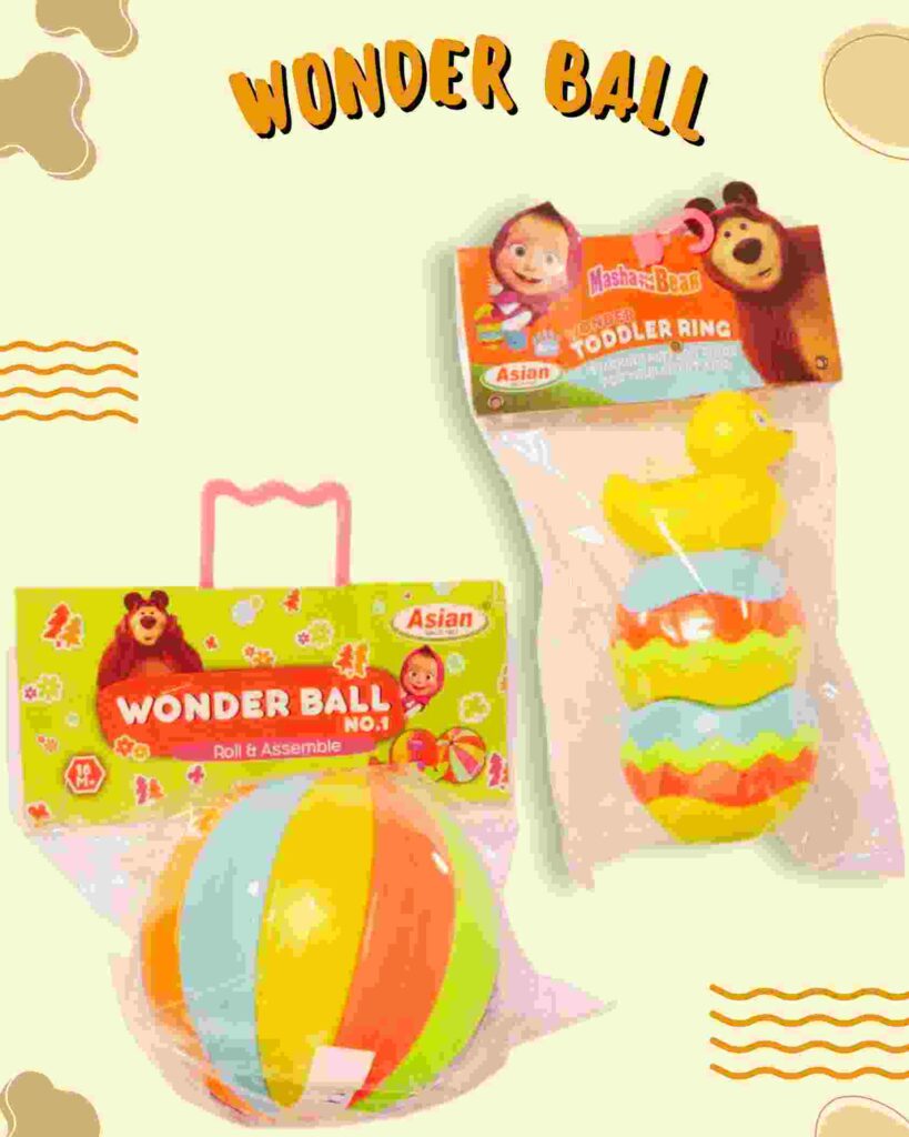
    Packaging Design: Created customized packaging for various toy categories, ensuring:
  • Bright, engaging visuals that reflect the fun and educational nature of the toys.
  • Clear labeling, age-range identifiers, and instructions to support informed buying decisions.
  • Durable, print-ready designs suitable for large-scale production and retail display.
  • Brand Alignment: Ensured every box design was consistent with Asian Toys’ brand identity by maintaining a cohesive color palette, fun typography, and friendly illustrations.
  • Child-Centric Approach: Integrated design elements that appeal directly to young children, such as playful characters, bold colors, and real-toy visuals—Designed packaging featuring popular licensed cartoon characters such as Shinchan, Kiko, Masha and The Bear, and Dora, ensuring accurate representation and high visual impact.
  • Results :

  • Delivered packaging that stands out on shelves and instantly communicates product value
  • Enhanced brand recognition and buyer confidence through professional, cohesive designs
  • Supported Asian Toys’ retail expansion by creating scalable and print-ready packaging assets